Journalism 390
In the Journalism 390 course, I have gained better ability within Adobe’s Creative Cloud (InDesign, Photoshop, Illustrator). While I enjoy some more than others, knowing each software allows me to create detailed design products.
Large Projects
Magazine Spread
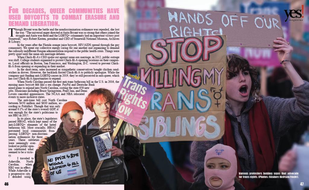
I chose this Yes! Magazine article to align with my ongoing interest in design centered around the LGBTQ+ community, which I find vibrant and creatively freeing. I used the core colors of the trans pride flag—light pink, baby blue, and white—and selected photos from the same photographer to maintain visual consistency. The color palette makes the spread easy on the eyes while supporting my maximalist style.
I focused on visual hierarchy to guide the reader’s eye and kept the copy legible amidst a busy layout. I used the Impact font for headlines and captions to match the bold tone. In Photoshop, I applied masking tools to wrap text around figures on page 46 and blur backgrounds on pages 45 and 47. I created a timeline infographic in Illustrator to show major boycotts mentioned in the article. While not perfect, I feel the spread effectively tells the story and was a rewarding design challenge.
Newspaper Spread
It was fun getting back into InDesign—I used it a lot in high school for newspaper, so it felt familiar. I like how the gridlines keep everything neat and make it satisfying when things snap into place.
Recreating the Star Tribune spread reminded me what I like and don’t like in design. I loved the green accents and clean white space in the masthead, but the left-heavy layout made it hard to balance content. Matching fonts was also fun—it’s wild how much a serif vs. sans serif can change the vibe. This definitely helped me see layout differently.
Inforgraphic
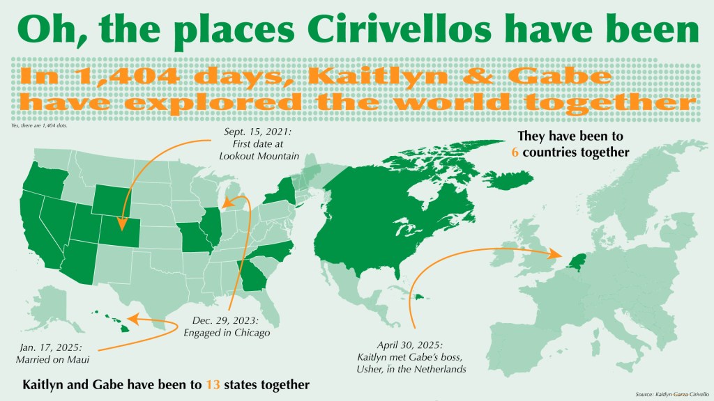
My sister got married in January with just immediate family, but she’s throwing a larger reception this summer and asked me to design some decorations. I created this infographic to show where she and her husband have traveled together. It includes a dot chart for how many days they’ve been together and maps highlighting states and countries they’ve visited.
I stuck with a green color palette for cohesion, using varying opacities and orange accents to highlight key info. The serif-style font adds a touch of elegance, and overall, I think the layout is clean, cohesive, and easy to understand.
Editorial Illustration
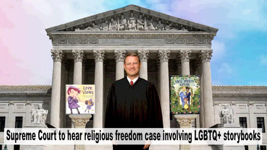
This project is based on a Washington Post article about the Supreme Court hearing a religious freedom case involving LGBTQ+ storybooks. I used the Supreme Court building as the backdrop and added a rainbow gradient sky to reference the LGBTQ+ community.
I masked an image of Chief Justice Roberts as the focal point and placed two storybooks on pedestals with shadows and beveling to blend into the steps. I slightly posterized everything to unify the style. The rainbow sky adds a whimsical, camp feel that complements Roberts’ grin. I think the illustration captures the tone and focus of the article well.
Assignments
AI Generated Podcast Cover
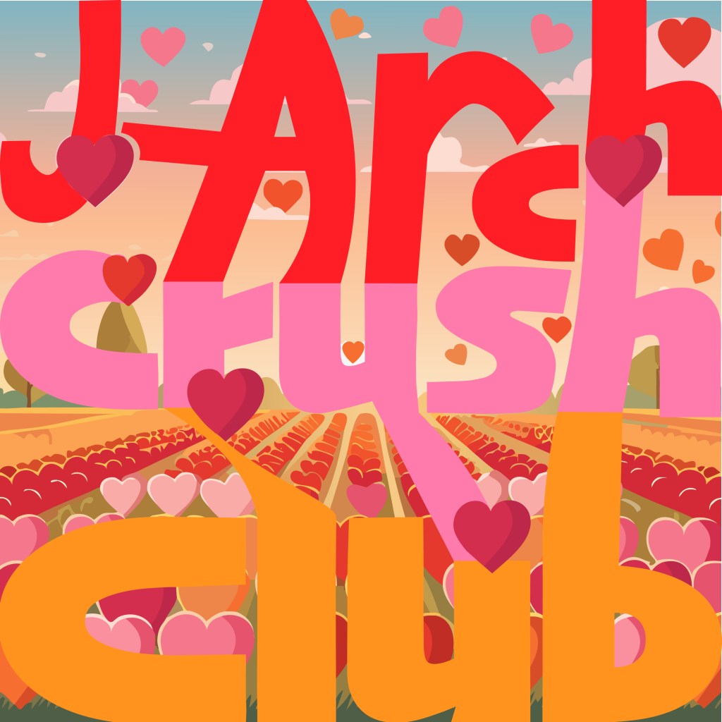
Here is “J-Arch Crush Club,” a podcast Archana and I joke about making all the time. I incorporated gestalt in the way the letters connect and lead together around the hearts. The letters on the bottom almost align with the field to show continuity. I AI generated the the field of hearts and edited the hearts to go around the letters.
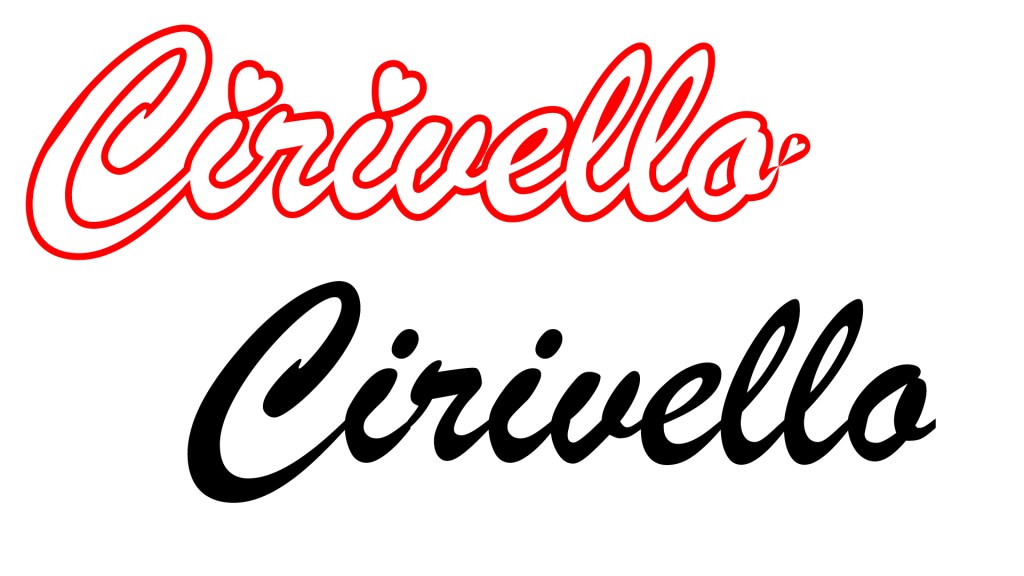
Custom Font
I used Brush Script MT Italic to design a logo for my sister’s new last name. I added heart accents, adjusted letter shapes, and used a red outline with white fill to create a fluid, cursive look. I also connected the letters with the pen tool to remove gaps.
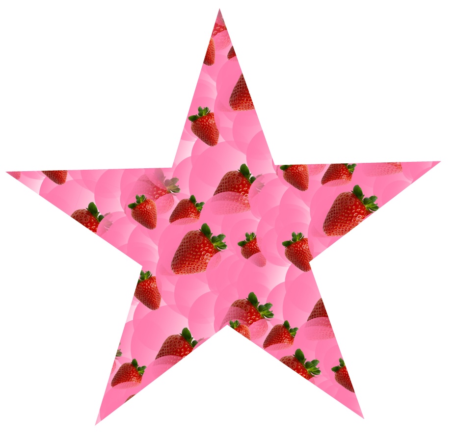
Custom Pattern
For this Illustrator assignment, I created a custom pattern. I used a strawberry png file from creative commons and overlayed it with some various pink-gradient circles. I repeated and rotated the pattern and then filled this star with the pattern. I saved it to my pallet, maybe I will use it someday!
Proudly powered by WordPress
